The history of israel - palestine
An interactive narrative on the history of Israel-Palestine

PROJECT SUMMARY
- Project Type: Group Project
- Role: Interaction Designer
- Skills used: Research, Sketching, Wireframing, Visual Design, Entity-Mapping, Video Editing.
- Tools: Sketching, Balsamiq, Photoshop, PremierPro, Illustrator, D3, Google Drive.
- Process: Literature Review, Data Gathering, Ideation, Wireframing, Prototyping, Testing & Evaluation.
About
Conflicts in the middle east has been an ongoing phenomenon, and the recent Israeli-Hamas conflict has renewed interest of the public in the subject. The roots of the conflict are complex and involves many different chains of events affecting and shaping each other.
This visualization enables readers to visually see all parallel event chains, and follow them individually while being aware of all of them. By showing them causal arrows, it enabled them to understand how various events affected and shaped each other - something that reading a history text may not reveal immediately. The search and filtering options available allows the reader quickly find any specific event they may be interested in and learn more about it.
objective
The overarching goal of this interactive visualization is to help its readers easily form a clear mental picture of this history that created the conflict. We also wish to allow the reader to dive deeper into how individual events, or individual political groups guided these events to their current state, and hence form their own data-driven opinion of the political groups that influenced these events.
why
The network of causalities between these events is also complex, especially in turbulent times when multiple chains of events are afoot simultaneously. All this makes for a large body of information which is currently only available in the form of history texts. For the casual reader, it is hard and time consuming to read these large texts. Even when they do read, the fact that multiple parallel events are afoot is not evident from the text-based medium, and that makes it hard to conceive a clear mental picture of the complete historical account.
Wireframe
The view of choice (Timelines), was chosen since events in time are typically represented in a chronological order. The alternatives were between a horizontal Vs. vertical chronological order. The horizontal order was chosen because it suits how users typical read and follow narratives (read-flow going from left to right). Also, the screen space was best maximized by ordering elements this way. It takes fewer scrolls to view all chains in the timeline this way, than when ordered vertically.
Navigational Schemas like OZFD (Overview first, Zoom & Filter, then Detail-on-Demand) was followed in deciding what elements to be represented on the screen. The SSE (Search, Show context, then Expand-on-Demand) was also integrated to complement the initial schema. This was represented using a global search field.

Design components
The proposed design had two major components:
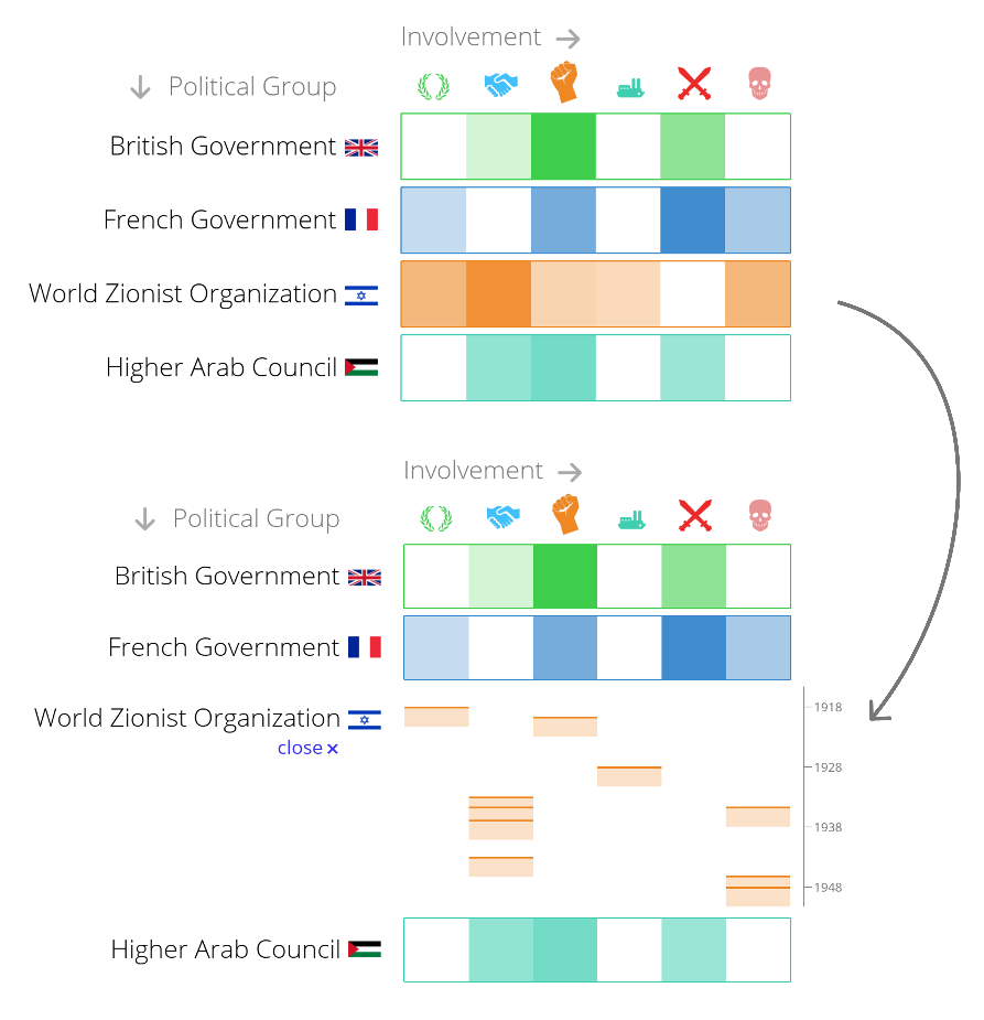
- Clustered Timeline View; showing events within different categories
- Matrix Heat-map View; showing the frequencies of different types of causal relationships.
The Matrix Heat-map view was scrapped from the final design based on feedback.